If you’re a freelance writer, do you have a website for your services?
If you do, are you attracting clients with it or is your site sitting there, unable to convince anyone who shows up, why they should hire you?
Maybe you have a blog already with a Hire Me page, hoping to land your ideal client.

If this sounds like you and you’re struggling to reach those high-paying clients, maybe this is the year to focus on creating an optimized writer website and brand.
How My Writer Website Evolved
My writer website has gone through a few changes in only a short period of time. It seems as a new year approaches, I get the itch to tweak my site, change things around and breathe new life into my brand.
And this year is no different. I changed my logo, color, home page and parts of my copy. I mostly focused on attracting my ideal client – digital marketing businesses or entrepreneurs.
And it’s working. I’ve already landed three digital marketing clients with this new focus.
So, how did I go from newbie freelance writer with several niches and hardly any samples to now having prospects regularly contact me for digital marketing content?
Let’s look at how my writer website evolved.
First Year: The Newbie Freelance Writer
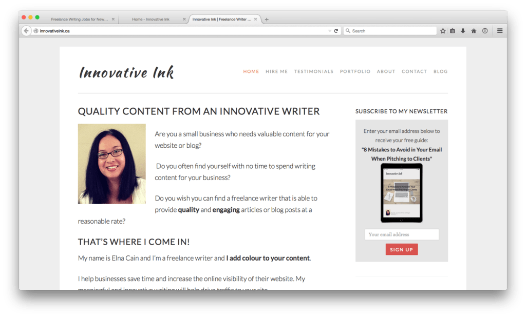
I used a free WordPress theme called Sketch (it’s no longer available). Some great things about my home page are:
- I have a headshot – this creates a level of trust for new prospects who go to my site.
- I explain who I want to write for – my first question asks small businesses if they need valuable content for their blog.
- I introduce myself and make it known how I can help small businesses if they hire me – a prospect can quickly tell that I’m a freelance writer who writes articles or blog posts and who can help them increase their online visibility of their site.
I had this website for only a few months before I changed it, and it helped me land clients, but they weren’t my ideal clients. I didn’t care at the time since it was paid work, right?
Looking at it now, there are elements I could’ve improved upon, like:
- I had no call-to-action above the fold – this screenshot is of what you would see above the fold (before you scrolled) and there is no button or link to contact me. This could have lost me some potential business. People are busy and they want to know right away who you are and how to contact you.
- My headline is weak – my headline, Quality Content from an Innovative Writer, doesn’t speak much of anything. I mean I’m sure my next door neighbor can make this claim. It’s pretty generic and broad. This, again, doesn’t speak directly to my ideal client. Businesses and entrepreneurs want more than just quality content; they want a writer who can help them grow their business.
- My lead magnet doesn’t speak to my potential client – I created a lead magnet to grow my email list, but I wanted to attract freelance writers, not really businesses since my blog focused on writers. But, if you are a prospect who landed on my site and saw that, they may be confused about what my true message is.
- My copy is weak – I don’t clearly define what I do and how I can really help a business. Really, it doesn’t show my unique selling point. This is what makes me stand out from other writers. In this copy, I just say I provide engaging and quality content – any writer can provide this.
So, I knew once the New Year hit, I wanted to change my site and tweak it for better conversions.
Second Year: The Confident Freelance Writer
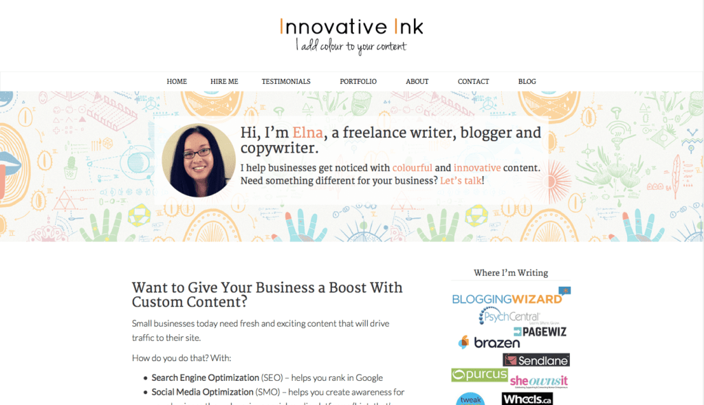
My second year was the first full year I was a freelance writer. I grew a lot during this time, both in my business and in my confidence.
I wanted my writer website to reflect more of my unique selling point, which is adding color to your content. And I was able to land more clients closer to my ideal client.
If you noticed, I made a new logo, added a call-to-action above the fold, introduced myself and told prospects what exactly I do. And my headline and body speaks to what I provide if you hire me.
I also added a “where I’m writing” section, which I was excited to do once I had guest posts and client pieces to promote. Throughout the year I have added new logos to highlight the best clients and guest post pieces.
Overall, I love this site. It speaks exactly what I wanted to reveal to prospects. But, towards the latter half of the year, I really started honing in on the digital marketing niche and this site just wasn’t cutting it.
Third Year: The Seasoned Freelance Writer
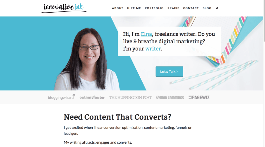
This is my updated site now.
It’s the same look today.
This site is highly optimized to speak to a digital marketing business or entrepreneur. With a new logo, color and headshot, I changed my copy to attract my ideal client. I also added some high authority sites I’m writing for.
I worked on changing my homepage copy to let prospects know the value I have as a writer and what I can do for their business.
The new site isn’t 100% done, but I’m happy with it.
I’m also excited to see how this will convert in the long-term, but I suspect from the recent inquiries for my digital marketing content, that I’m attracting my ideal client now.
5 Ways to Optimize Your Writer Website to Attract Clients
So, how do you know if your website isn’t attracting clients (besides the fact no one’s contacting you)?
One of my coaching clients, Elise, has been a writer for years, but really wanted to ramp it up for this year. I took a look at her website (this is a screenshot of her entire homepage).
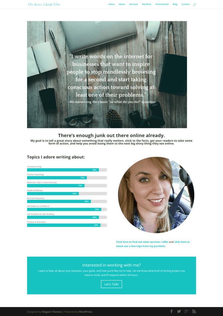
Now, on first impression, it’s quite nice!
She has her headshot on the front page, what she likes to write about, and a headline to pique your interest: There’s enough junk out there already.
The rest of her pages were great – her About page wasn’t all about her, she had strong testimonials and a full portfolio.
But, as I read her copy, I quickly saw the problem – she wasn’t speaking to the client.
Her copy stressed she wanted to:
- inspire people with her writing
- write about what really matters
- make a difference in people’s choices
While this is nice and all, clients aren’t interested in all that (magazines and newspapers probably are; but she wasn’t writing for them or mentioned she wanted to write for them when we spoke). So, if you think your site isn’t converting like you think it should, here are 5 ways to give your website an update:
1. Speak to the Client
Your writer website should speak to your ideal client. What if you don’t know your ideal client?
That’s okay! Take some time today and think about who you want to write for.
Is it big brands? Small businesses? Publications? Universities? The hotel industry? Influencers? Authors? The list could go on.
Once you narrow down the who, next is the what. So, what will you write about? This is also known as your niche.
If you don’t have a niche, you will have a hard time taking your freelance writing business to the next level and attracting high-paying clients.
If you don’t have a niche, start thinking about what you want to get paid to write about.
2. Convey Your Niche
Looking at her website, you might notice she doesn’t expertly tell us her niche. She does tell us what she likes to write about:
- Conscious living
- Positive psychology
- Self-discipline and habit
(notice these topics aren’t that popular in the I want to get paid to write category).
She also calls herself a lifestyle writer. But that’s it. I don’t know if she writes only blog content, articles or anything else.
So, when looking at your home page, do you make it clear what niche you write in?
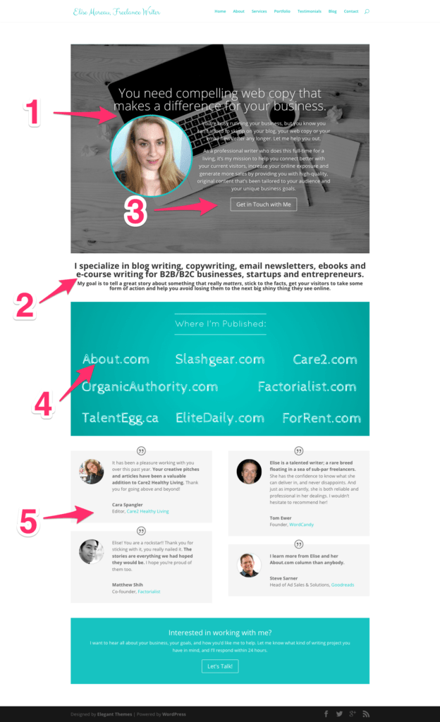
3. Place Your Call-to-Action Above the Fold
Remember the goal of your writer website is to:
- Convince a prospect you are the writer for them
- Have prospects contact you!
Make it easy for a prospect to contact you. Have a call-to-action button, social media profiles, Skype ID, phone number and any other ways to contact you easily accessible.
Have this information throughout your website too.
4. Be Proud of Where You are Writing
While researching this writer’s portfolio I learned she is a writer for About.com.
But, looking at her site, it was nearly impossible to know this. About.com is a huge authoritative site to be writing for and she could’ve leveraged this platform to help her attract high-paying clients…but she wasn’t.
When you start landing guest post spots and paid writing gigs, be proud of where you are writing. When I launched my new site, I made a little collage of where I was writing, and added to the list as the year went on:


While these aren’t all the places I’ve written for, I wanted to highlight certain businesses and guest post spots.
If you landed some guest posts and paid gigs, be proud of it and promote it on your site!
5. Include Social Proof (Testimonials)
One new thing I added to my home page were some testimonials. I feel having social proof can really help your credibility as a legit writer.
While I always did have testimonials on my site, I never put them in my home page.
It’s a good idea to have some social proof on your home page; this can tip the scales in your favor if a prospect is on the fence about hiring you.
Okay, so want to see how my coaching client updated her site for better conversions? After our coaching call, she worked on her writer website and now it’s totally speaking to clients!
Your advice really helped – the CEO of a startup contacted me through my site last week about a project and now we’re talking. Crazy how a few good tweaks can really make a huge difference.
Stand Out as a Writer
While it isn’t necessary to have a writer website in the beginning, it is vital to your business growth as a writer.
In the beginning you can get away with using Contently or LinkedIn for your portfolio, but in the long run, clients seek professionalism and having your own writer website looks professional.
And if you really focus on your copy to speak to the client, make it easy to contact you, explain your niche and have social proof in a simple design, you can have a site that converts.
Over to you – what are you going to do to optimize your writer website?


45 Comments