You’ve put nothing but blood, sweat, and tears into your freelance writing, but there’s still one area that’s kicking your butt: your writing website.
You’ve spent hours trying to make it great, only you’re still unsure of how it looks to clients.
You’re not alone.

Any freelance writer who has tried to start a website for their freelance business has been in that am-I-doing-it-right stage.
But, guess what? A lot of writers do get it wrong the first time around. The sad thing is that we all tend to make the same writing website mistakes over and over.
It’s time to end that.
I’ve come up with 6 common rookie mistakes that you might be making on your writing website. By knowing these rookie writing website mistakes I hope you reverse them and see an increase in landing writing jobs!
Let’s get started.
Writing Website Tips for You

1. Writing Website Mistake – You Talk Too Much About Yourself
Let’s look at this:
“Welcome to my site! I’m Jane Doe, a freelancer with six years of experience writing online. Prior to becoming a freelance writer, I spent twelve years in the insurance industry. When I’m not working, you can find me taking long walks with my border collie. My recent work has been seen in publications like Entrepreneur Magazine and Time. Learn more about my writing services here.”
What’s wrong with that blurb?
On the surface, it might seem fine. Jane’s background and experience is certainly impressive, right?
Usually, your experience, writing portfolio, and testimonials can sell your services on their own, but it’s also important that your website copy sells you, too. Jane isn’t doing the latter.
What’s the biggest problem with Jane’s web copy?
She doesn’t mention her clients at all! Absolutely every statement is focused on her.
That immediately drives a wedge between Jane and her readers.
The truth is that your website isn’t about you. It’s about your clients and how you can solve their problems. This is something I teach in Writeto1k.
Instead of taking a “me” approach to your writing, look at how you can benefit your clients.
Start by figuring out their problem, and then show them how you can fix it. Instead of saying “Welcome to my site,” Jane might start off by identifying with her prospects.
“Are you short on time and web content? Hi, I’m Jane Doe, and I can help on both accounts.”
Now she’s connected with her prospects, identified their problem, and let them know that she’s the solution.
Your content won’t necessarily follow this same format, and there’s always room for a creative approach, but one thing is certain: you need to make your clients care.
Create client-focused copy through the following steps:
- Identify your target client’s issue. What is your ideal client’s problem? Is he short on time? Does he not have the skills to write decent content? Is he having trouble converting readers into customers?
- Determine how you can solve that issue. Next, tell prospects that you’re the solution, and then give a few solid reasons why you’re the best solution for them.
- Decide what’s relevant. There’s no need to mention your dog or where you grew up unless it’s relevant. For instance, if you blog about pet care, then mentioning your dog and volunteer work at a humane society will interest clients. But if it’s something that won’t spark your ideal client’s interest, then it’s best to leave it out.
Don’t be afraid to get creative with your website copy.
Come up with a unique angle to solving their problem if you can, or rearrange the above suggestions.
2. Writing Website Mistake – You Have No Clear Call-to-Action
You want to turn your visitors into clients, right?
Of course you do! That’s the whole purpose of your writer website. There’s a simple way to do that: include a call-to-action.
But how do you get them to your call-to-action? Tell them where to go next, and give them a clear choice.
Too often freelance writers don’t include a call-to-action at all.
This mistake is simple to fix. Just include a call-to-action!
Your call-to-action should include these things:
- It should be prominent. If you have to ask someone else if your call-to-action is clear enough, then it probably isn’t.
- It should get prospects to hire you. As a freelance writer, that is your goal, isn’t it? Feel free to get creative with your wording, but in the end you want clients to contact you and place an order for your services.
- It should be clear where to go next. Don’t clutter your content with six calls to action. Your site visitors won’t know where to go and may not make it anywhere.
3. Writing Website Mistake – You Don’t Clearly Define Your Services

When it comes to your services, calling yourself a “freelance writer” isn’t enough. Unfortunately, that’s as far as a lot of people get.
This is exactly what I did when I first started and while I was able to land work, as soon as I defined what I offered in my title, I landed high-paying work and more work too!
Freelance writing comes in so many different forms that leaving it at “freelance writer” doesn’t really tell anyone what you do.
Okay, so you write, but what kind of content do you write?
Do you write fiction or non-fiction? Blog posts or magazine articles?
White papers, case studies, landing page content, advertising copy, brochure content, eBooks, training material, and technical manuals are just some examples of the types of services writers might offer.
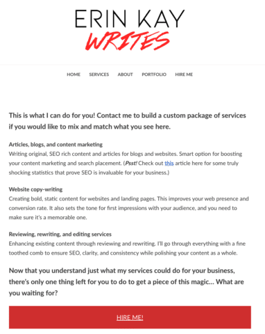
Writeot1k student Erin shows exactly what she offers to prospects on her services page of her writing website.
What if you only offer one service? The concept is still the same.
Maybe you offer blogging services, but what exactly that entails may differ from another freelance blogger.
Do you offer blog management services, or only blog writing services?
Are your blog posts in-depth research articles complete with personal interviews, or are they more opinion based pieces? What topics are you willing to write about?
All these questions are things clients will want to know. It can save you both time and put you on the same page if you specify all of this directly on your website.
4. Writing Website Mistake – You’re Not Paying Attention to Above the Fold
“Above the fold” refers to the content on your website that people see before scrolling.
Having the most important elements above the fold is an important design technique that helps drive attention to the most important points.
Research shows that even though people scroll, they spend 80 percent of their time looking at the content above the fold and 20 percent of the time below the fold.
The Neilsen Norman Group says, “The real estate above the fold is more valuable than stuff below the fold for attracting and keeping users’ attention.”
As well, Neil Patel points out that you want your most important information in the top 768 pixels.
Even given this research, many writers are not conscious of what’s showing up when the page first loads. Some common mistakes include:
- Letting your header text take up the majority of your above-the-fold space
- Placing low-priority sidebar widgets above the fold
- Allowing a single – and oftentimes irrelevant – image dominate the space
- Keeping contact information and important calls-to-action below the fold
What should be above the fold?
The answer is simple: Whatever is most important to you and your prospects.
Along with your headline, it’s also a good idea to have an explanation of your services somewhere above the fold so that people aren’t confused about what you do.
A tagline usually works well for this. Something simple like “freelance marketing copywriter,” “freelance business blogger,” or even “the guy you call when you need custom white paper copy” works well.
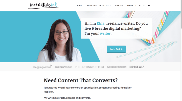
A headshot is also a good thing to have above the fold on your home page because it helps brand your business and welcomes your visitors.
This is what I do for my writing website:
Another important element is your main call-to-action. If it’s “Contact Me,” then you’ll want your contact information or a link to your contact tab above the fold.
Also, your navigation buttons will almost always be above the fold since you want to make it easy for prospects to find what they’re looking for.
Word of warning: Don’t forget that your writing website looks different from device to device, so it’s worth testing out how your website appears on desktop, tablets, and smartphones.
How can you test it out?
You can use the Google’s Mobile Friendly Test. You can see what your site looks like on different devices.
The key to making this concept work for you is to ask yourself what’s most important and what you want prospects to focus on. Once you have that answer, you’ll have an easier time designing your above-the-fold content.
5. You Have Headshot Mistakes
There are lots of ways freelance writers go wrong with their headshots.
The first is that you lack a headshot completely. Yikes!
While there’s no rule that says you need a headshot or clients won’t hire you, it’s an something that can help brand your business and bring a bit of personality to it.
It also lends a bit of credibility to your business because it proves that you’re the real person behind it all.
Don’t want to show your face online? One thing some freelancers do is have a cartoon drawing created.
That way, people can still put a face to your name, but you’re not putting your private self out there.
Another common mistakes freelancers make is using a blurry or unprofessional headshot on their website.
That’s not to say you need a professional to take your photo. Even amateurs can snap a clear photo that gives off an “I’m a professional” vibe.
Here are a few do’s:
- Look at your setting. A solid background against a white wall always looks great. A selfie that you snapped on the beach with people in bikinis in the background? There’s a time and a place for that, and on your writer website isn’t one of them. My first headshot was against my beige wall.
- Think about your lighting and angle. Natural, soft light is generally good whereas taking a shot on a bright, sunny day can shadow your face and make the photo look award. Also pay attention to the angle of the shot. Something straight-on usually gives off a more professional vibe. You might also consider taking a close-up shot so you don’t have to crop it down so far and lose some of the clarity.
- Choose your camera wisely. A headshot taken with a camera phone is okay, but the clarity is usually better with a decent point-and-shoot camera. If you have the option, go with the higher quality camera.
- Make it look natural. A genuine smile is more inviting than a fake one.
What about headshot don’ts?
- Don’t crop yourself out of a group photo. This can sometimes work depending on the photo, but in general, cropping yourself out of a group photo will look awkward since your body is likely positioned toward the group, not the camera. Furthermore, it will likely be blurry since group shots usually use a wider camera angle.
- If possible, don’t take the photo yourself. Selfies get awkward when considering professional appearance. That’s because the selfie pose is It can work if you’re careful about your positioning, but in general, it won’t give off as much of a professional appeal than if you have a friend snap your photo or if you use a tripod.
- Don’t change your headshot every week. Your headshot is a branding element that people will associate with your services. While you may want to update your headshot every few years or so, it will only confuse people if you’re changing your professional image as often as you chance your Facebook profile photo.
You can certainly use a photo that you’ve taken in the past, but if you can’t find one that’s clear and makes you come off looking like a professional, then perhaps it’s time to set up your own mini photo session.
A final headshot mistake writers make is burying their headshot in a place where no one can find it.
At the very least, you want your headshot at the top of your about page copy, but it’s even a better idea to place your smiling face on your home page since it helps create an inviting appeal.
Some writers keep their headshot in their sidebar while others place it directly into their content.
Sometimes writers even integrate their headshot into their site’s header image. Whichever way you choose to go, be sure that it’s easy to find and above the fold so that clients have something to associate your name with.
6. Your Writer Website Isn’t User-Friendly

Writers work best with words, and not so much with tech, right? At least that’s right for me!
While we may go ahead and design our own website, not all of us are great at the visual aspects.
However, a quality web design can create a more user-friendly experience that will turn mere visitors into paying clients.
Unfortunately, some writers fall short in their web design by making it nearly impossible to navigate. If your web theme looks something like this, you’re probably turning off clients.
Unless you’re saying all you need to say in one page, you want to make it easy to navigate your site, and that can be done through a prominent and clutter-free navigation panel.
To make your website even easier to navigate, you might include a search function, especially if you have a blog on your site with a lot of content.
A few other things that can kill your site’s user-friendliness include:
- Poor content layout. Some writers who are accustom to academic writing stick with the essay-like concepts they learned in college, but web writing comes with a different set of ideas.
- A slow response time. Forty percent of people abandon sites that take 3 or more seconds to load. You can boost your speed by upgrading your hosting package or tweaking a few things in your website’s files.
- Broken links. Go through your website, and make sure every link leads to the page you intend it to. If you’re trying to link to your contact information but the site delivers a 404 page, you can bet you’re losing some prospects who were planning on contacting you.
Hiding your contact information and cluttering your content with information prospects don’t care about also hinder your user-friendliness.
If you go on about your passion of writing as a child and add your writing niche and type of client at the end of that blurb, you could be potentially losing clients with the first sentence.
Make sure to stick to the information you want clients to know about you – i.e. your writing service.
There Ya Go!
If you need more help with your writing website, make sure to enroll in my Writeto1k website will I help you with every page on your writer website and more!
Over to you – what is a writing website mistake I forgot to mention? Let me know!
Need a Website For Your Freelance Writing But Stuck With the Tech Part?


12 Comments